
Choosing calm colors can make your home feel more comfortable, welcoming, and easy to live in. The right shades may help a room feel brighter, more spacious, or more restful without requiring major changes to furniture or layout.
Calm colors are not limited to plain white walls. Soft greens, muted blues, warm neutrals, gentle grays, and earthy tones can all create a peaceful atmosphere. The key is to choose colors that work with your home’s natural light, furnishings, and the mood you want each room to have.
Start With the Feeling You Want
Before choosing paint or accessories, think about how you want the room to feel. A bedroom may benefit from quiet, restful colors, while a living room might need a soft and inviting palette.
Ask yourself:
– Should the room feel cozy or open?
– Do you prefer warm or cool colors?
– Will the space be used for rest, work, entertaining, or several purposes?
– Which colors already appear in your furniture, flooring, or artwork?
Your answers can help narrow your choices. If you want a relaxed and welcoming look, warm beige, soft taupe, or muted clay may work well. For a fresher feeling, consider pale blue, sage green, or a soft gray with warm undertones.
Consider Warm and Cool Undertones
Every color has an undertone, even colors that appear neutral. Understanding undertones can help you avoid combinations that feel uncomfortable or unbalanced.
Warm colors often include hints of yellow, red, or orange. Warm whites, creamy beige, sand, and soft tan can make a room feel comfortable and inviting.
Cool colors often include hints of blue, green, or violet. Pale blue, misty gray, and muted green can give a room a clean and peaceful quality.
Warm and cool colors can work together, but it helps to choose one main direction. For example, a warm beige room may look more cohesive with cream, tan, and soft brown accents. A cool blue-gray room may pair well with white, pale gray, and natural green.
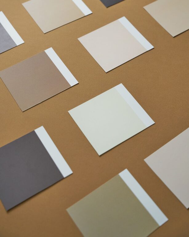
If you are unsure, compare paint samples beside your flooring, countertops, or largest piece of furniture. Existing materials can make an undertone more noticeable.
Use Natural Light as a Guide
Natural light can change how a color looks throughout the day. A shade that appears soft and warm in the morning may look cooler in the afternoon.
Consider the direction of the windows:
– North-facing rooms often receive cooler, softer light. Warm neutrals can help make these spaces feel more inviting.
– South-facing rooms usually receive stronger light. Both warm and cool colors may work, but muted shades can prevent the space from feeling too bright.
– East-facing rooms receive warm morning light and cooler light later in the day.
– West-facing rooms may appear softer earlier and warmer in the afternoon or evening.
Always test a color in the actual room before making a final decision. Paint a small section of the wall or place large sample boards around the space. Check them in the morning, afternoon, and evening.
Explore Calm Color Families
Several color groups are especially useful for creating a peaceful home.
Soft Neutrals
White, cream, beige, taupe, and light gray are versatile choices. They provide a simple background and allow furniture, textiles, and artwork to stand out.
To keep a neutral room from feeling flat, combine several textures. Add woven baskets, linen curtains, wood furniture, a soft rug, or knitted throws. Small differences in texture can add warmth without introducing strong color.
Gentle Blues
Muted blue can create a quiet and airy feeling. Look for shades with gray or green undertones rather than very bright or highly saturated blues.
Pale blue works well in bedrooms, bathrooms, and rooms with plenty of natural light. Deeper dusty blue can add comfort to a living room or reading corner when balanced with light furniture and warm wood tones.
Soft Greens
Sage, eucalyptus, olive, and other muted greens can bring a natural quality indoors. These shades often pair well with wood, rattan, stone, and cream-colored fabrics.
Soft green is a useful option if you want a color that feels more interesting than a neutral but still remains gentle. It can work in bedrooms, kitchens, hallways, and home offices.
Earthy Tones
Muted terracotta, clay, sand, and warm brown can make a room feel grounded. Choose softened versions instead of bright orange or red if your goal is a calm atmosphere.
Earthy colors work especially well with natural materials and simple furniture. Use them on one wall, in textiles, or through accessories if you prefer a lighter touch.
Create a Simple Color Palette
A calm room usually benefits from a limited color palette. One easy approach is the 60-30-10 method:
– Use one main color for about 60 percent of the room, such as the walls and larger surfaces.
– Add a secondary color for about 30 percent, such as furniture, curtains, or a rug.
– Use an accent color for about 10 percent through pillows, artwork, lamps, or decorative objects.
The percentages do not need to be exact. The goal is simply to avoid using too many competing colors.
For a peaceful living room, you might combine warm white walls, a light beige sofa, and muted green or blue accents. In a bedroom, soft gray walls, cream bedding, and natural wood details can create a balanced look.
Use Color in Layers
You do not have to apply a color to every wall. Layering color through smaller elements gives you more flexibility.
Try adding calm shades with:
– Area rugs
– Curtains
– Bedding
– Throw pillows
– Blankets
– Artwork
– Lampshades
– Ceramic pieces
– Plants and planters
This approach is helpful if you are renting or want to experiment before repainting. It also makes seasonal updates easier. You can change a few accessories while keeping the main wall color consistent.
Be Careful With Very Bright Colors
Bright colors are not automatically unsuitable, but highly intense shades can make a room feel energetic rather than restful. If you enjoy bold color, use it in small amounts or choose a softer version.
For example, replace bright turquoise with dusty blue, strong yellow with muted ochre, or vivid red with soft terracotta. These adjusted shades still add personality while keeping the overall mood more relaxed.
You can also use a bold color in a small area, such as the inside of a bookcase, a powder room, or a single accent wall.
Coordinate With Existing Features
Look at the elements that are staying in the room before choosing a new color. Flooring, countertops, cabinets, upholstery, and large artwork can all influence the best palette.
If your floors have warm wood tones, cream, beige, sage, and muted blue may coordinate well. If your room includes cool gray tile, soft white, blue-gray, and pale green may create a more unified appearance.
Do not match every item exactly. Instead, look for colors that share a similar undertone or visual softness. A little contrast can make the room feel more natural and interesting.
Choose What Feels Comfortable to You
Color trends can offer inspiration, but your home should reflect your own preferences. A color may be popular and still not feel right in your space.
Collect images of rooms you enjoy and look for patterns. You may notice that you prefer warm neutrals, pale colors, natural materials, or rooms with darker accents. Use those observations to build a palette that feels personal.
The best calm color scheme is one that supports your daily life. By testing samples, considering natural light, limiting the number of colors, and adding texture, you can create rooms that feel balanced, comfortable, and welcoming.
About the Author